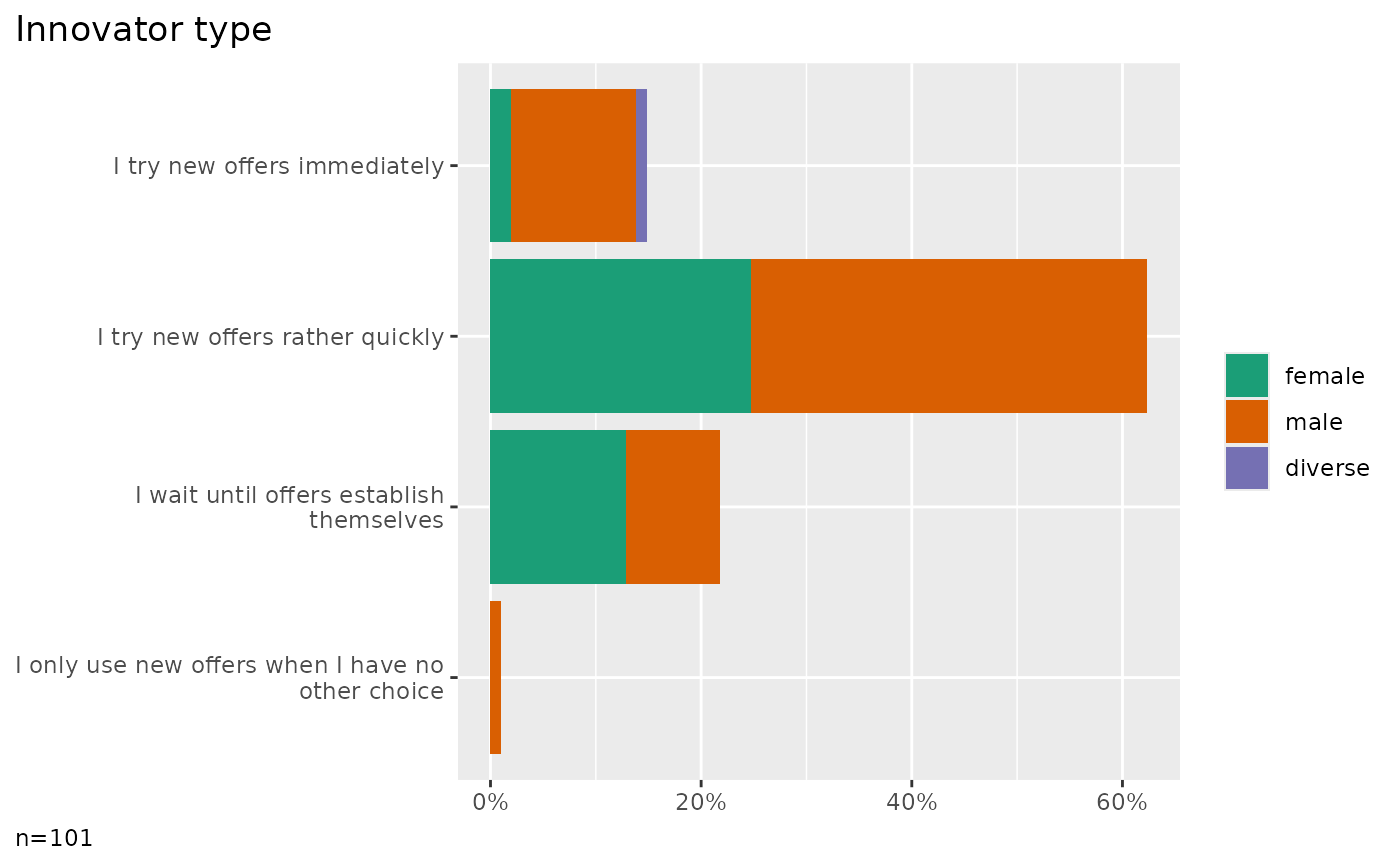
Plot frequencies cross tabulated with a grouping column
Source:R/plots.R
plot_counts_one_grouped.RdPlot frequencies cross tabulated with a grouping column
Usage
plot_counts_one_grouped(
  data,
  col,
  cross,
  category = NULL,
  prop = "total",
  width = NULL,
  tiles = FALSE,
  npmi = FALSE,
  limits = NULL,
  ordered = NULL,
  numbers = NULL,
  title = TRUE,
  labels = TRUE,
  clean = TRUE,
  ...
)
Arguments
- data
A tibble.
- col
The column holding factor values.
- cross
The column holding groups to split.
- category
The value FALSE will force to plot all categories. A character value will focus a selected category. When NULL, in case of boolean values, only the TRUE category is plotted.
- prop
The basis of percent calculation: "total" (the default), "rows" or "cols". Plotting row or column percentages results in stacked bars that add up to 100%. Whether you set rows or cols determines which variable is in the legend (fill color) and which on the vertical scale.
- width
By default, when setting the prop parameter to "rows" or "cols", the bar or column width reflects the number of cases. You can disable this behavior by setting width to FALSE.
- tiles
Set tiles to
TRUEto generate a heatmap with case numbers or npmi values see the npmi-parameter.- npmi
Set npmi to
TRUEto generate a heatmap based on npmi values. Only valid in combination with tiles = TRUE.- limits
The scale limits, autoscaled by default. Set to
c(0,100)to make a 100 % plot.- ordered
The values of the cross column can be nominal (0), ordered ascending (1), or descending (-1). By default (NULL), the ordering is automatically detected. An appropriate color scale should be chosen depending on the ordering. For unordered values, colors from VLKR_FILLDISCRETE are used. For ordered values, shades of the VLKR_FILLGRADIENT option are used.
- numbers
The numbers to print on the bars or tiles, a vector with one or more of: - "n" (frequency), - "p" (percentage) - "npmi" (normalized pointwise mutual information)
- title
If TRUE (default) shows a plot title derived from the column labels. Disable the title with FALSE or provide a custom title as character value.
- labels
If TRUE (default) extracts labels from the attributes, see codebook.
- clean
Prepare data by data_clean.
- ...
Placeholder to allow calling the method with unused parameters from plot_counts.